Mercari is a resell website in Japan
Role
UI Design, UX Research
Timeline
1 week
Goal
Redesign for a more user friendly experience and encourage customer engagement
Restraints
Larger scale testing and company data on site traffic
Frustrations in usability
When visiting Mercari one day I wanted to scan their vintage items and was distracted by the interface- in fact I was put off enough that I gave up and left the site. After bringing this up this up with a few friends, I realized that it wasn’t just me, it was a common problem. But because of its popularity, people tolerated it.
This presented an opportunity to redesign the interface and improve the user experience, interaction, and attitude towards the company.
How can we improve without alienating existing customers?
Identifying the problem
After speaking with some users, it was clear that the visual design itself was a big issue. Because it was unappealing, it came off as untrustworthy and users were getting tired of navigating the site.
The goal was to redesign in a way that would appeal to Mercari's user base while encouraging shopping and engagement.
Researching user preferences
From research I found that the top needs of users were:
1. Organization - Users want to be able to quickly choose between categories, brands, what's popular or trending, etc. Users have a hard time scanning the site on their own.
2. Design Appeal- Users want a modern interface that makes it enjoyable to shop. The current design makes them feel cluttered.
Wireframing
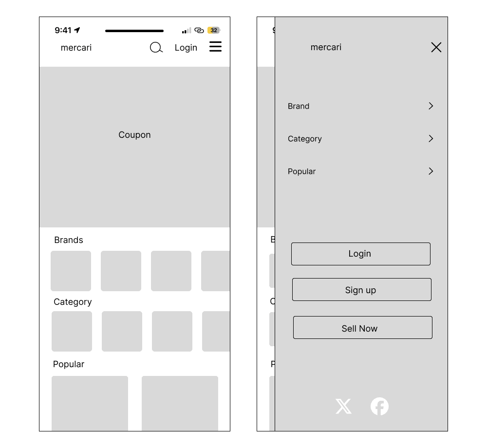

Organization decisions
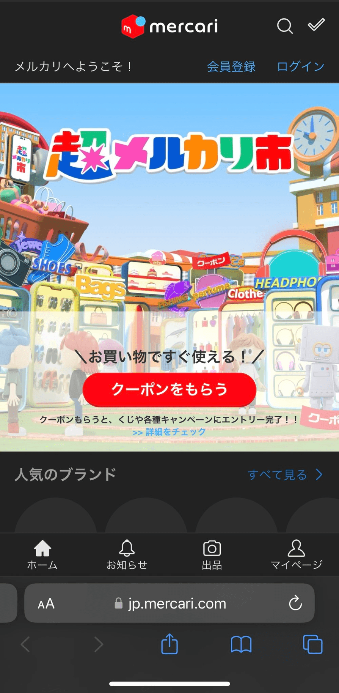
In Japan having large coupons that command space are quite common- I decided to bring this to the top of the landing page since this is a design norm here.
I structured the site into topics that would make it easiest for customers to locate what they needed, integrating a prominent ‘Sell Now’ button to encourage more user activity.
Simple iterations for a strong impact

Functional features
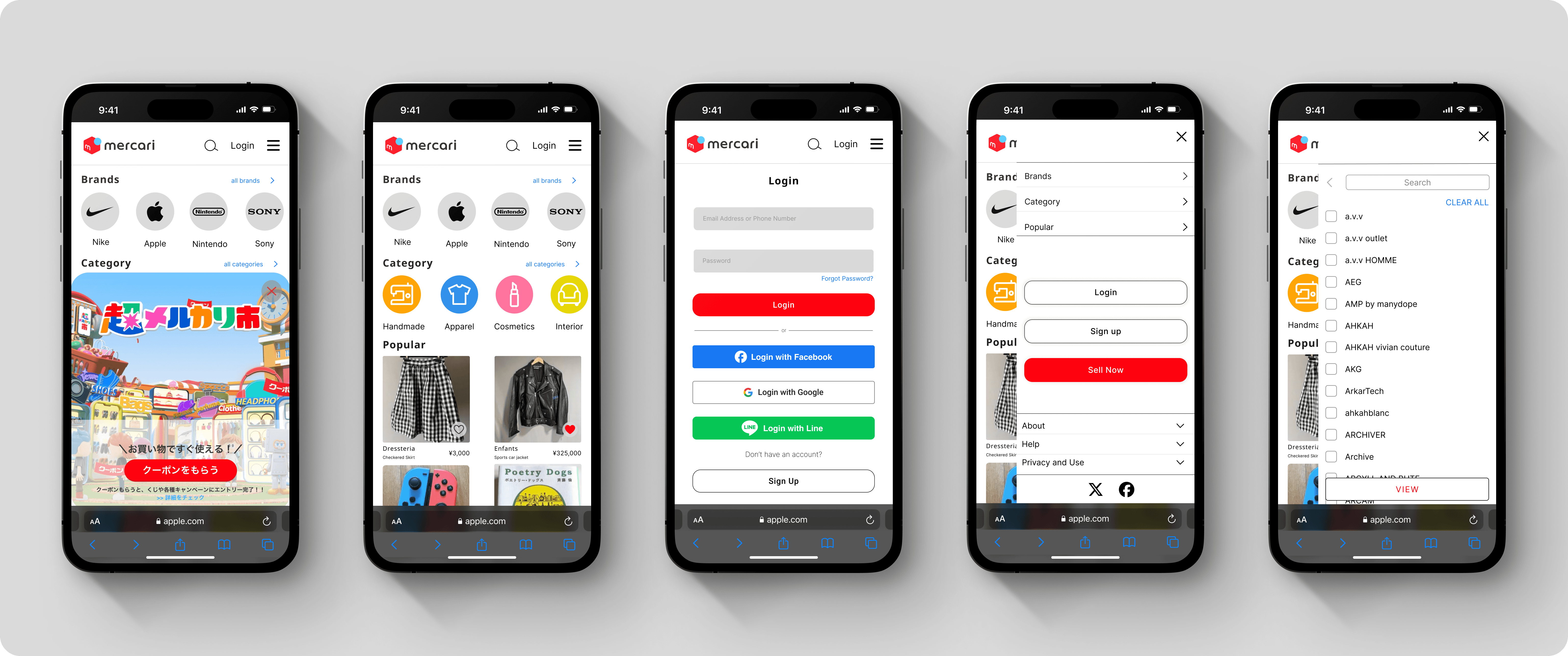
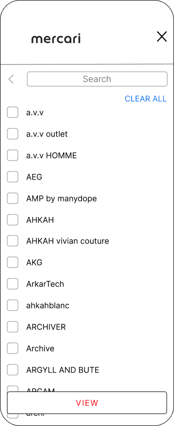
Initially, users could only search for one brand at a time, but to improve the shopping experience, I added checkboxes to be able to select multiple brands at a time.
The View button at the bottom would stay fixed on the screen as users scrolled down, making it easy to view their selections at any moment. For user correction, the Clear All button was added.
Finally, a back arrow next to the search bar would help users go back to the menu selection without having to exit and re enter the hamburger menu.
Each of these small additions come together to bring efficiency and increase usability.
Visuals that change the experience

Redesigning the landing
Simple icons and recognizable brand logos were used, making the interface much more intuitive. This also created a separation between Brand and Category items, creating organization for users.
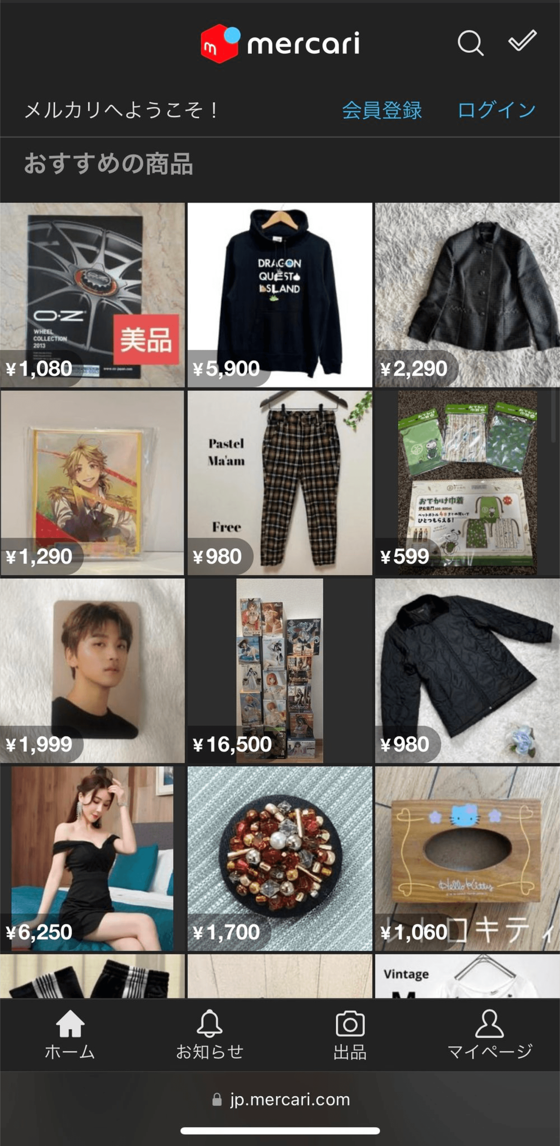
To draw more attention to each product and without overwhelming the customers, I made the posts larger and reorganized into 2 columns. A short description of the item underneath with the price to provide information to customers, and a Heart icon so users could easily favorite the item without disrupting user flow.
Color usage for a clearer path
The final design incorporates bright colors and icons for clear organizational structure, helping customers navigate the site without clutter.
To accommodate Japan user preferences, elements such as the large coupon on the homepage and Email login at the top of the Login page were added.
Key Takeaways
In this project, I learned that simple functions when added together make a big difference in efficiency, and consequently the overall experience for the user. While having good visuals is important, it’s equally important that the design guides the users into making certain choices.
Everything is purposeful!
Mercari is a resell website in Japan
Role
UI Design, UX Research
Timeline
1 week
Goal
Redesign for a more user friendly experience and encourage customer engagement
Restraints
Larger scale testing and company data on site traffic
Frustrations in usability
When visiting Mercari one day I wanted to scan their vintage items and was distracted by the interface- in fact I was put off enough that I gave up and left the site. After bringing this up this up with a few friends, I realized that it wasn’t just me, it was a common problem. But because of its popularity, people tolerated it.
This presented an opportunity to redesign the interface and improve the user experience, interaction, and attitude towards the company.
How can we improve without alienating existing customers?
Identifying the problem
After speaking with some users, it was clear that the visual design itself was a big issue. Because it was unappealing, it came off as untrustworthy and users were getting tired of navigating the site.
The goal was to redesign in a way that would appeal to Mercari's user base while encouraging shopping and engagement.
Researching user preferences
From research I found that the top needs of users were:
1. Organization - Users want to be able to quickly choose between categories, brands, what's popular or trending, etc. Users have a hard time scanning the site on their own.
2. Design Appeal- Users want a modern interface that makes it enjoyable to shop. The current design makes them feel cluttered.
Wireframing
Organization decisions
In Japan having large coupons that command space are quite common- I decided to bring this to the top of the landing page since this is a design norm here.
I structured the site into topics that would make it easiest for customers to locate what they needed, integrating a prominent ‘Sell Now’ button to encourage more user activity.
Simple iterations for a strong impact
Functional features
Initially, users could only search for one brand at a time, but to improve the shopping experience, I added checkboxes to be able to select multiple brands at a time.
The View button at the bottom would stay fixed on the screen as users scrolled down, making it easy to view their selections at any moment. For user correction, the Clear All button was added.
Finally, a back arrow next to the search bar would help users go back to the menu selection without having to exit and re enter the hamburger menu.
Each of these small additions come together to bring efficiency and increase usability.
Visuals that change the experience
Redesigning the landing
Simple icons and recognizable brand logos were used, making the interface much more intuitive. This also created a separation between Brand and Category items, creating organization for users.
To draw more attention to each product and without overwhelming the customers, I made the posts larger and reorganized into 2 columns. A short description of the item underneath with the price to provide information to customers, and a Heart icon so users could easily favorite the item without disrupting user flow.
Color usage for a clearer path
The final design incorporates bright colors and icons for clear organizational structure, helping customers navigate the site without clutter.
To accommodate Japan user preferences, elements such as the large coupon on the homepage and Email login at the top of the Login page were added.
Key Takeaways
In this project, I learned that simple functions when added together make a big difference in efficiency, and consequently the overall experience for the user. While having good visuals is important, it’s equally important that the design guides the users into making certain choices.
Everything is purposeful!
Mercari is a resell website in Japan
Role
UI Design, UX Research
Timeline
1 week
Goal
Redesign for a more user friendly experience and encourage customer engagement
Restraints
Larger scale testing and company data on site traffic
Frustrations in usability
When visiting Mercari one day I wanted to scan their vintage items and was distracted by the interface- in fact I was put off enough that I gave up and left the site. After bringing this up this up with a few friends, I realized that it wasn’t just me, it was a common problem. But because of its popularity, people tolerated it.
This presented an opportunity to redesign the interface and improve the user experience, interaction, and attitude towards the company.
How can we improve without alienating existing customers?
Identifying the problem
After speaking with some users, it was clear that the visual design itself was a big issue. Because it was unappealing, it came off as untrustworthy and users were getting tired of navigating the site.
The goal was to redesign in a way that would appeal to Mercari's user base while encouraging shopping and engagement.
Researching user preferences
From research I found that the top needs of users were:
1. Organization - Users want to be able to quickly choose between categories, brands, what's popular or trending, etc. Users have a hard time scanning the site on their own.
2. Design Appeal- Users want a modern interface that makes it enjoyable to shop. The current design makes them feel cluttered.
Wireframing
Organization decisions
In Japan having large coupons that command space are quite common- I decided to bring this to the top of the landing page since this is a design norm here.
I structured the site into topics that would make it easiest for customers to locate what they needed, integrating a prominent ‘Sell Now’ button to encourage more user activity.
Simple iterations for a strong impact
Functional features
Initially, users could only search for one brand at a time, but to improve the shopping experience, I added checkboxes to be able to select multiple brands at a time.
The View button at the bottom would stay fixed on the screen as users scrolled down, making it easy to view their selections at any moment. For user correction, the Clear All button was added.
Finally, a back arrow next to the search bar would help users go back to the menu selection without having to exit and re enter the hamburger menu.
Each of these small additions come together to bring efficiency and increase usability.
Visuals that change the experience