
Light and dark modes with minimize option for menu
Role
UI Design, UX Research
Timeline
3 weeks
Goal
Create a UI design for a travel planning platform which utilizes AI
Restraints
AI engineering for personalized client testing
AI is revolutionizing our tasks and content production speed
AI is reshaping every industry and is quickly becoming an integral part to many platforms. I live abroad and travel a lot, so I wanted to create a travel planning tool that utilizes AI and adapts to this technological shift . SYNC is designed to simplify trip planning by integrating AI and allowing for personal customization.
The goal was to make the planning process more efficient while giving users control over their trip decisions.
Design Process

What design strategies can be implemented for seamless AI integration?

Research and Approach
I focused on current AI travel tools to see what worked and what didn’t. I found that many use chatbots, but they tend to feel impersonal and robotic. I wanted SYNC to not only talk to the AI but be able to implement specific suggestions immediately. Combining the AI interaction with a visual planner so users could always refer back to their personalized schedule.
Wireframes & Layout


Design decisions
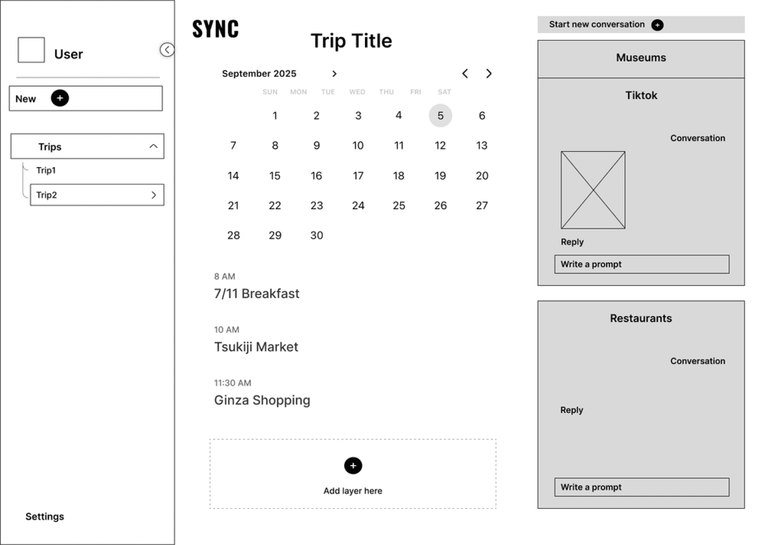
I kept the layout simple: the schedule on the left and AI conversation boxes on the right. Users can chat with the AI to find activities and then drag those suggestions into their schedule in real-time. This creates a dynamic interaction where the AI isn’t just a chatbot but an assistant, and is fully integrated into the user’s workflow.
I chose a clean, modern color scheme of greys and blues, for simplicity with color to guide usability. The contrast between the conversation boxes and the schedule organizes the different components and ensures the user’s focus remains on their trip, while the overall interface stays clean and uncluttered.
Features & functionality

Simplifying complex tasks
Initially I wanted to keep the deign as minimalist as possible: three simple steps to begin by selecting a destination, travel dates, and then activities. But after some user testing it was clear this setup didn’t provide enough user guidance, which led me to introduce more functions at Step 3.
At this point, I added the "Start a Conversation" button, quick activity icons, collaboration options, and the conversation box—creating a comprehensive user experience.
The challenge was ensuring these features didn’t overwhelm or confuse users, so I carefully organized the layout to keep it intuitive and sensible while offering the necessary options. There are also helper guides that pop up along the way to advise users on next steps.
Learning & iterations


Final results
During the design process, I experimented with different color schemes, button placements, and ways to integrate AI in a way that feels both natural and efficient. After feedback and testing, the final design reflects a simple yet powerful interface that allows users to plan efficiently with the help of AI, while still feeling and being in control.
Adapting to trends
Through this project, I learned how important it is to strike a balance between adding features and maintaining simplicity in UI/UX design. It helped me improve my problem-solving skills, particularly in organizing functionalities without overwhelming the user. I also gained experience in integrating AI into a user-centered interface. This project reinforced the importance of iteration and user feedback, and I feel more confident in designing solutions that adapt to emerging trends like AI.
Key Takeaways
In this project, I learned the importance of balancing multiple features with a clear, intuitive UI. Adding AI challenged me to create a smooth user flow while keeping things personal for the user. Simplicity and flexibility are crucial in helping users interact confidently with complex tools. This project highlighted the value of iteration and thoughtful design in adapting with emerging technologies.
Light and dark modes with minimize option for menu
Role
UI Design, UX Research
Timeline
3 weeks
Goal
Create a UI design for a travel planning platform which utilizes AI
Restraints
AI engineering for personalized client testing
AI is revolutionizing our tasks and content production speed
AI is reshaping every industry and is quickly becoming an integral part to many platforms. I live abroad and travel a lot, so I wanted to create a travel planning tool that utilizes AI and adapts to this technological shift . SYNC is designed to simplify trip planning by integrating AI and allowing for personal customization.
The goal was to make the planning process more efficient while giving users control over their trip decisions.
Design Process
What design strategies can be implemented for seamless AI integration?
Research and Approach
I focused on current AI travel tools to see what worked and what didn’t. I found that many use chatbots, but they tend to feel impersonal and robotic. I wanted SYNC to not only talk to the AI but be able to implement specific suggestions immediately. Combining the AI interaction with a visual planner so users could always refer back to their personalized schedule.
Wireframes & Layout
Design decisions
I kept the layout simple: the schedule on the left and AI conversation boxes on the right. Users can chat with the AI to find activities and then drag those suggestions into their schedule in real-time. This creates a dynamic interaction where the AI isn’t just a chatbot but an assistant, and is fully integrated into the user’s workflow.
I chose a clean, modern color scheme of greys and blues, for simplicity with color to guide usability. The contrast between the conversation boxes and the schedule organizes the different components and ensures the user’s focus remains on their trip, while the overall interface stays clean and uncluttered.
Features & functionality
Simplifying complex tasks
Initially I wanted to keep the deign as minimalist as possible: three simple steps to begin by selecting a destination, travel dates, and then activities. But after some user testing it was clear this setup didn’t provide enough user guidance, which led me to introduce more functions at Step 3.
At this point, I added the "Start a Conversation" button, quick activity icons, collaboration options, and the conversation box—creating a comprehensive user experience.
The challenge was ensuring these features didn’t overwhelm or confuse users, so I carefully organized the layout to keep it intuitive and sensible while offering the necessary options. There are also helper guides that pop up along the way to advise users on next steps.
Learning & iterations
Final results
During the design process, I experimented with different color schemes, button placements, and ways to integrate AI in a way that feels both natural and efficient. After feedback and testing, the final design reflects a simple yet powerful interface that allows users to plan efficiently with the help of AI, while still feeling and being in control.
Adapting to trends
Through this project, I learned how important it is to strike a balance between adding features and maintaining simplicity in UI/UX design. It helped me improve my problem-solving skills, particularly in organizing functionalities without overwhelming the user. I also gained experience in integrating AI into a user-centered interface. This project reinforced the importance of iteration and user feedback, and I feel more confident in designing solutions that adapt to emerging trends like AI.
Key Takeaways
In this project, I learned the importance of balancing multiple features with a clear, intuitive UI. Adding AI challenged me to create a smooth user flow while keeping things personal for the user. Simplicity and flexibility are crucial in helping users interact confidently with complex tools. This project highlighted the value of iteration and thoughtful design in adapting with emerging technologies.
Light and dark modes with minimize option for menu
Role
UI Design, UX Research
Timeline
3 weeks
Goal
Create a UI design for a travel planning platform which utilizes AI
Restraints
AI engineering for personalized client testing
AI is revolutionizing our tasks and content production speed
AI is reshaping every industry and is quickly becoming an integral part to many platforms. I live abroad and travel a lot, so I wanted to create a travel planning tool that utilizes AI and adapts to this technological shift . SYNC is designed to simplify trip planning by integrating AI and allowing for personal customization.
The goal was to make the planning process more efficient while giving users control over their trip decisions.
What design strategies can be implemented for seamless AI integration?
Research and Approach
I focused on current AI travel tools to see what worked and what didn’t. I found that many use chatbots, but they tend to feel impersonal and robotic. I wanted SYNC to not only talk to the AI but be able to implement specific suggestions immediately. Combining the AI interaction with a visual planner so users could always refer back to their personalized schedule.
Wireframes & Layout
Design decisions
I kept the layout simple: the schedule on the left and AI conversation boxes on the right. Users can chat with the AI to find activities and then drag those suggestions into their schedule in real-time. This creates a dynamic interaction where the AI isn’t just a chatbot but an assistant, and is fully integrated into the user’s workflow.
I chose a clean, modern color scheme of greys and blues, for simplicity with color to guide usability. The contrast between the conversation boxes and the schedule organizes the different components and ensures the user’s focus remains on their trip, while the overall interface stays clean and uncluttered.
Features & functionality
Simplifying complex tasks
Initially I wanted to keep the deign as minimalist as possible: three simple steps to begin by selecting a destination, travel dates, and then activities. But after some user testing it was clear this setup didn’t provide enough user guidance, which led me to introduce more functions at Step 3.
At this point, I added the "Start a Conversation" button, quick activity icons, collaboration options, and the conversation box—creating a comprehensive user experience.
The challenge was ensuring these features didn’t overwhelm or confuse users, so I carefully organized the layout to keep it intuitive and sensible while offering the necessary options. There are also helper guides that pop up along the way to advise users on next steps.
Learning & iterations